Our Logo
Years ago, when we were still the Boston Healing Landscape Project, and funded by the Ford Foundation, we set out to design a logo and a related web image that would convey some of the core aspects of our work. We originally chose the term “Healing Landscape” to reflect an interest in the complex landscape of therapeutic resources in our city (even though this sometimes resulted in inquiries as to whether we were involved in gardening).
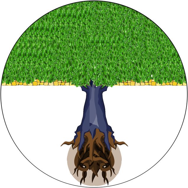
We wanted to combine an element related to the natural world, while including a sign of human cultural presence and influence. We opted for a tree with deep-sunk roots around a globe, to suggest that these therapeutic resources have a natural and organic global reach, growth, and role. The tree itself spread out to cover and shade its entire sphere.
The presence of human-constructed spaces is also a part of the landscape, as represented by by the yellow tiling just below the tree—suggesting that human reconfigurations of the world also overshadow this global sphere.
The original design resulted from a collaboration between Linda Barnes and Liam Hunt, our web designer at the time, and now Senior Programmer at the University of Kansas.
We made a commitment to the Ford Foundation to institutionalize our work at BU School of Medicine, to ensure that everything they had so generously supported for eight years would find a permanent home at the University. Inspired by a suggestion from Dr. Kenneth Edelin—then the Associate Dean for Student and Minority Affairs at Boston University Chobanian & Avedisian School of Medicine—the result was the Medical Anthropology & Cross-Cultural Practice program, which grew directly out of the work we had done in the BHLP. In redesigning our web site, we therefore chose to keep the logo and related imagery, to reflect the continuity and growth of our work.
